Time To Buy This Magnificent 7 Stock?
Usually investing is about spotting a stock that is underpriced relative to fair value. Trading is about finding a stock that meets some chart criterion. Maybe it’s a breakout, a cup-and-handle, a doji, or some buy signal or other. Whatever the approach, the focus is on a single position.
But sometimes, comparative analysis highlights opportunities that otherwise might fall under the radar. One such example right now is in a Magnificent 7 stock, arguably the most famous of them all.
If the chart we’re about to share is accurate, it would suggest there is an obvious way to capitalize right around the corner.
Key Points
- While investing and trading both typically focus on the merits of a single stock, comparative analysis offers unique insights.
- 1 Magnificent 7 stock right now is displaying signs of being a buy that haven’t been observed since 2022.
- The smart trade is not simply to buy one position but rather to simultaneously take opposing stances on two positions, as you will see below.
How To Spot The Opportunity
While traditional chart analysis looks at the price and volume – as well as any other indicators or patterns – of a single stock, comparative analysis offers a different lens through which to view opportunities.
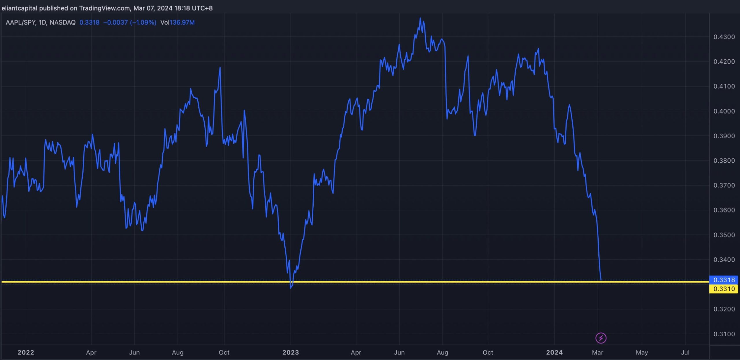
Imagine you could compare Apple to the S&P 500 to see when it hit its lows and highs in terms of relative performance. Instead of looking for traditional support and resistance levels, you could actually spot comparative support and resistance areas.
At support, the insight would allow you to see when Apple was likely to perform better than the S&P 500 and at resistance when it may be on the cusp of underperforming.
Take the most recent chart comparing Apple and the S&P 500. As you can spot instantly, Apple has dramatically underperformed the S&P 500 in recent months and trades at levels, comparatively, that it hasn’t seen since 2022.
So, how do you trade it?
Credit: Eliant_capital
How To Trade The Chart
To be clear, when Apple vs S&P 500 hits the support level shown, it doesn’t mean that Apple is necessarily going to bounce. It might, but that’s not what the trade is. Instead, it reveals that Apple is more likely to be stronger than the S&P 500, if past history repeats.
So back to the question, how do you trade the chart? The smarter approach is not to buy Apple alone. After all, if you buy Apple and it keeps falling, you might actually see the blue line bounce off support if the S&P 500 falls faster.
So the way to trade it is to simultaneously buy Apple and short the S&P 500. If the the S&P 500 continues to rise, the chart indicates that Apple should rise faster, so yes the short would lose money but Apple should make even more. Conversely, if the S&P 500 falls, the short will make money and should make more money than the long position in Apple would lose, assuming equal size positions.
The bottom line is betting on strength in Apple and relative weakness in the S&P 500 is the insight the chart reveals has historically led to success. Will it this time? Time will tell.


