Market Commentary: How To Read Charts To Make Money
Is the stock falling or consolidating? Is it pulling back in an uptrend or rising in a downtrend? Sometimes it’s just hard to know what’s what, and even harder to know how to make money from chart patterns, so let’s life the veil.
Key Points
- View charts on a weekly time horizon and a 2 year time frame to get a clear overview of broader trends.
- A close below or above key support and resistance levels respectively signals that a new trends is beginning,
- Distinguish as highlighted below between new bearish trends and pullbacks within bullish trends.
Consolidation: When Things Look So, So But Could Be Good
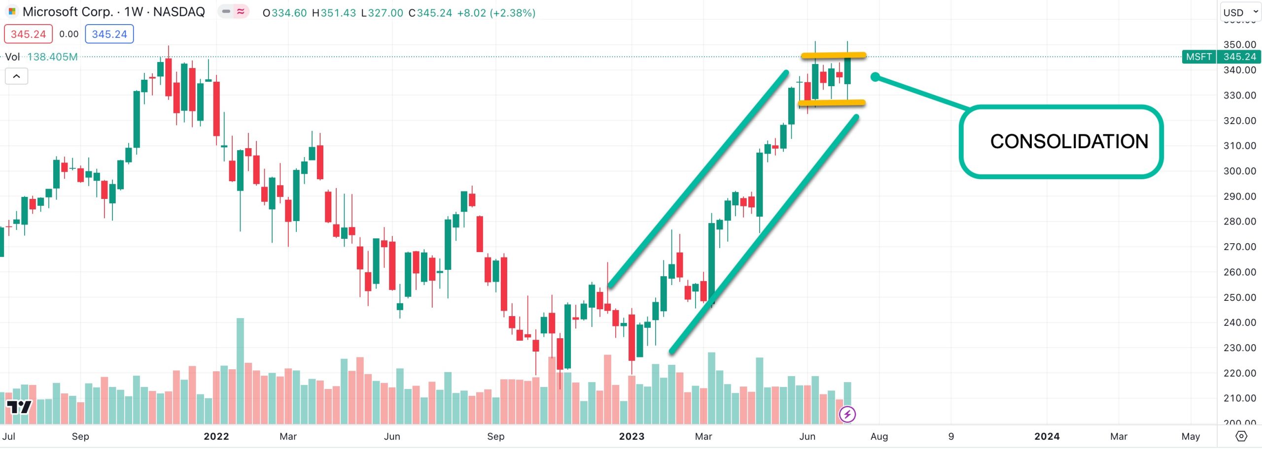
One of the most important steps to take when analyzing charts is to pick a longer time frame (for example, a 2-year chart with weekly intervals) to begin and then narrow the time window (for example a 3 month chart with daily intervals) to the present. In the example of Microsoft below, the 2 year time frame is helpful to see where the stock sits relative to the broader trend.
As you can see right away, a strong bullish trend kicked off at the start of the year. But then 5 weeks of consolidation followed. That’s easy enough to miss when you have your eyes on daily charts. If anything it might look like “chop” where the stock isn’t doing much of anything.
When you peer behind the curtain though, you can see Microsoft is simply consolidating. Generally, this type of consolidation is followed by a resumption of a bullish trend, but by having a weekly perspective on a 2-year chart, the nice thing is we don’t have to guess.
If the share price rises and closes on a weekly timeline above the upper yellow line, it’s off to the races again for Microsoft. If it breaks below and closes under the lower line, say sayonara to the most recent bullish trend, we’re probably moving lower.
When Is a Higher High On The Cards?
Now let’s imagine a stock has pulled back recently, this can create all sorts of confusion among traders. Is it the start of a downtrend, how do you know?
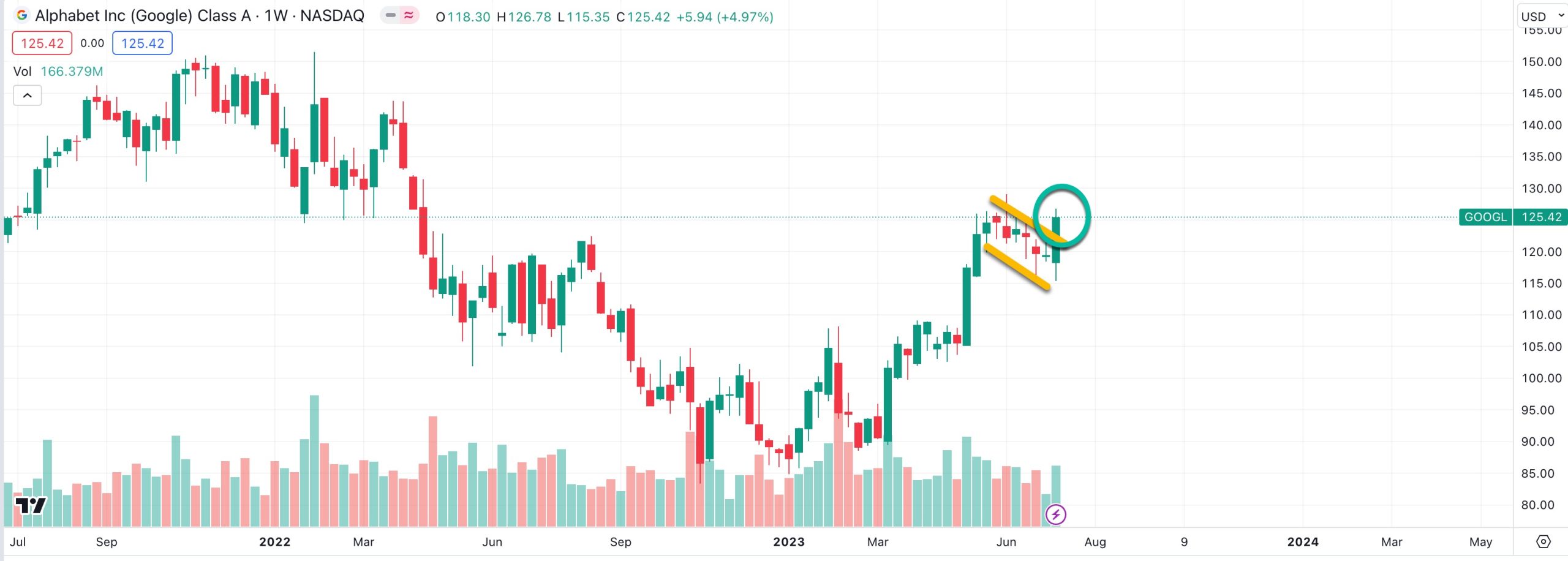
Alphabet (GOOGL) provides helpful insight to answer that question. Here, we see Alphabet too had a good run since the start of the year, and it also had a relatively flat few weeks.
But the difference is Google pulled back as you can see, forming a bull flag pattern on a weekly basis. So when it popped higher on the week ending July 14, it eclipsed in that single week all the losses over the prior 6 weeks. That shows powerful strength under the hood and suggests that Alphabet is poised to rise higher.
Of course, there is no guarantee that it will, but when you play these patterns again and again with stops, you strongly put the odds in your favor. In the case of Alphabet, below, if the share price were to fall back within the flag pattern, it would be time to cut and run, otherwise the trend can be ridden higher on the weekly.
One notable point on these patterns is that the price can rise or fall above key resistance and support lines during the week, and that’s okay. In and of themselves, that should not trigger an action being taken. However, if a stock is clearly breaking key levels before the Friday close, it’s time to limit losses and cut positions, otherwise you can let them run free in the direction originally expected.


