The Horrifying Chart That May Forecast A Plunge
Technical charts are littered with examples of historical comparisons. Is the most recent bullish run-up in the S&P 500 similar to the 1929 peak? Is the hype around AI similar to the buzz around the internet in 2000? Is the soaring Nvidia stock chart akin to the bull run in Cisco 24 years ago?
It’s hard to tell looking at a stock chart alone whether history will repeat or simply rhyme, but at the very least it can provide a pathway for what’s likely to come. A historical frame of reference means investors aren’t moving into unchartered waters without a rearview mirror to see what has happened in the past.
And right now, one chart above most others may reveal dark clouds up ahead.
Key Points
- Rising year-over-year CPI didn’t affect the S&P 500 in the early 1970s, initially.
- As time went by and it became clear that inflation was starting to soar, the market finally took notice.
- Before long, the S&P 500 corrected massively and the future for the current market has the hallmarks of acting similarly.
The Horrifying Chart Revealed
Perhaps the most terrifying reality as an investor is to have a thesis that gets entirely blown out of the water.
What’s worse is that the consensus is usually wrong, so it’s very easy to fall victim to a narrative and stop paying attention to what your eyes reveal to you is reality.
It’s a point that renowned investors, such as Stevie Cohen, commonly cite as pitfalls that most investors fall victim to. They start to believe in something and when data shows that reality conflicts with the belief, they deny reality and stick with their viewpoint.
Right now, that commonplace narrative is that interest rates must fall and the market is rising in anticipation of the Federal Reserve rate changes to come.
But what if the future is less rosy?
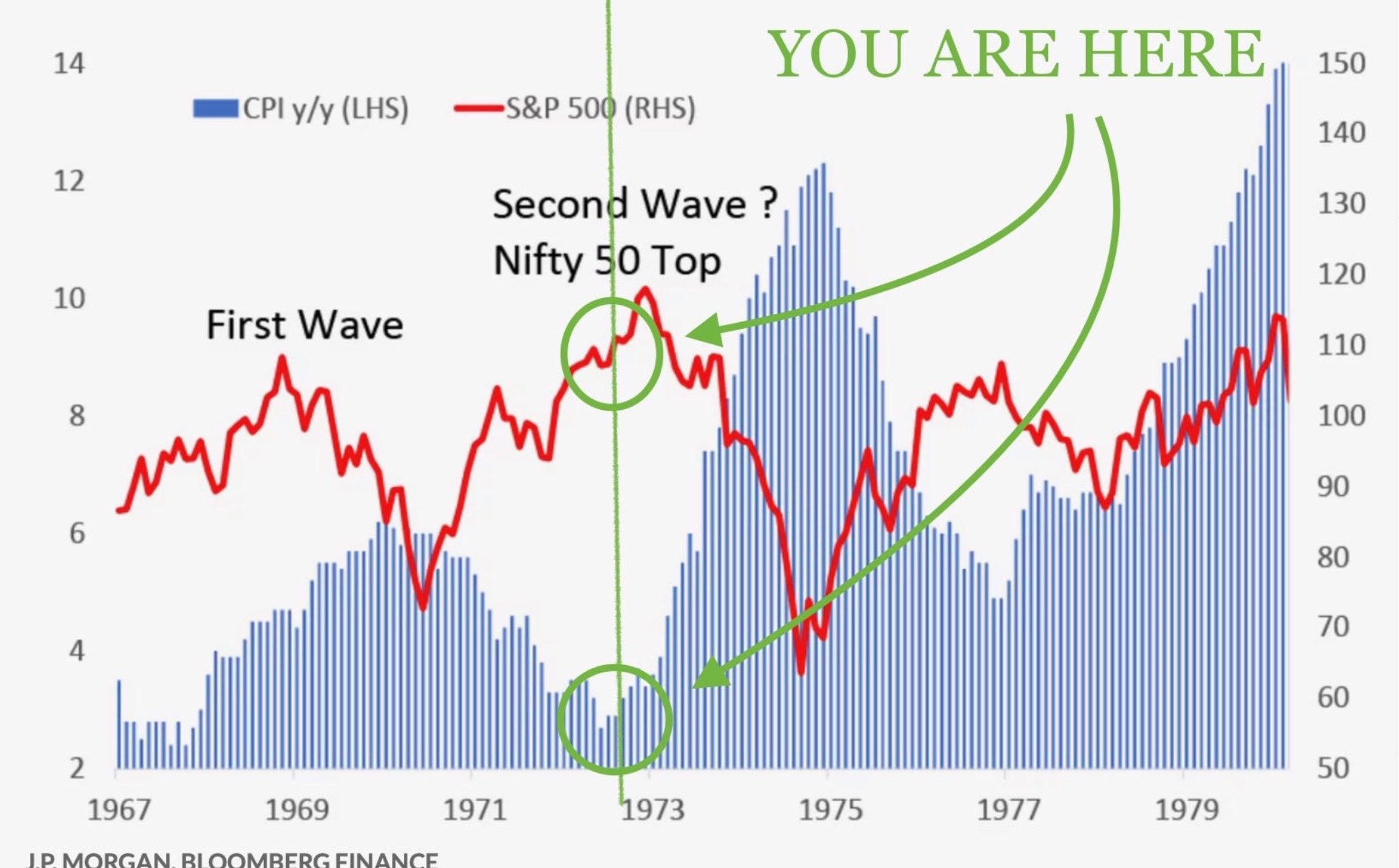
The chart below highlights what happened a few decades ago when CPI started to rise year-over-year.
Credit: JP Morgan Bloomberg Finance
Will History Repeat?
As you can see from the chart, a rise in CPI didn’t phase the market much back in the early 1970s. At least not at first.
Back then, the CPI reports continued to reveal inflation was rising and yet the S&P 500 continued to march higher. For a few quarters, the S&P 500 steadily rose, and then it started to soar.
As concerns over rising inflation spread, the market finally took notice.
Recently, a report came out that stated the average grocery bill is up by over $1,000 per month versus just 5 years ago. If that’s true, the average consumer is quickly going to feel the pinch.
Less money in their bank accounts means less overall consumer spending, which accounts for about 70% of GDP.
With the prospect of slower consumer spending on the horizon, companies earnings should feel the impact too. And then share prices will start to reflect the new reality.


